Mochiko Redesign
Packaging Design
Year
2023
Role
Designer
Client
School Project
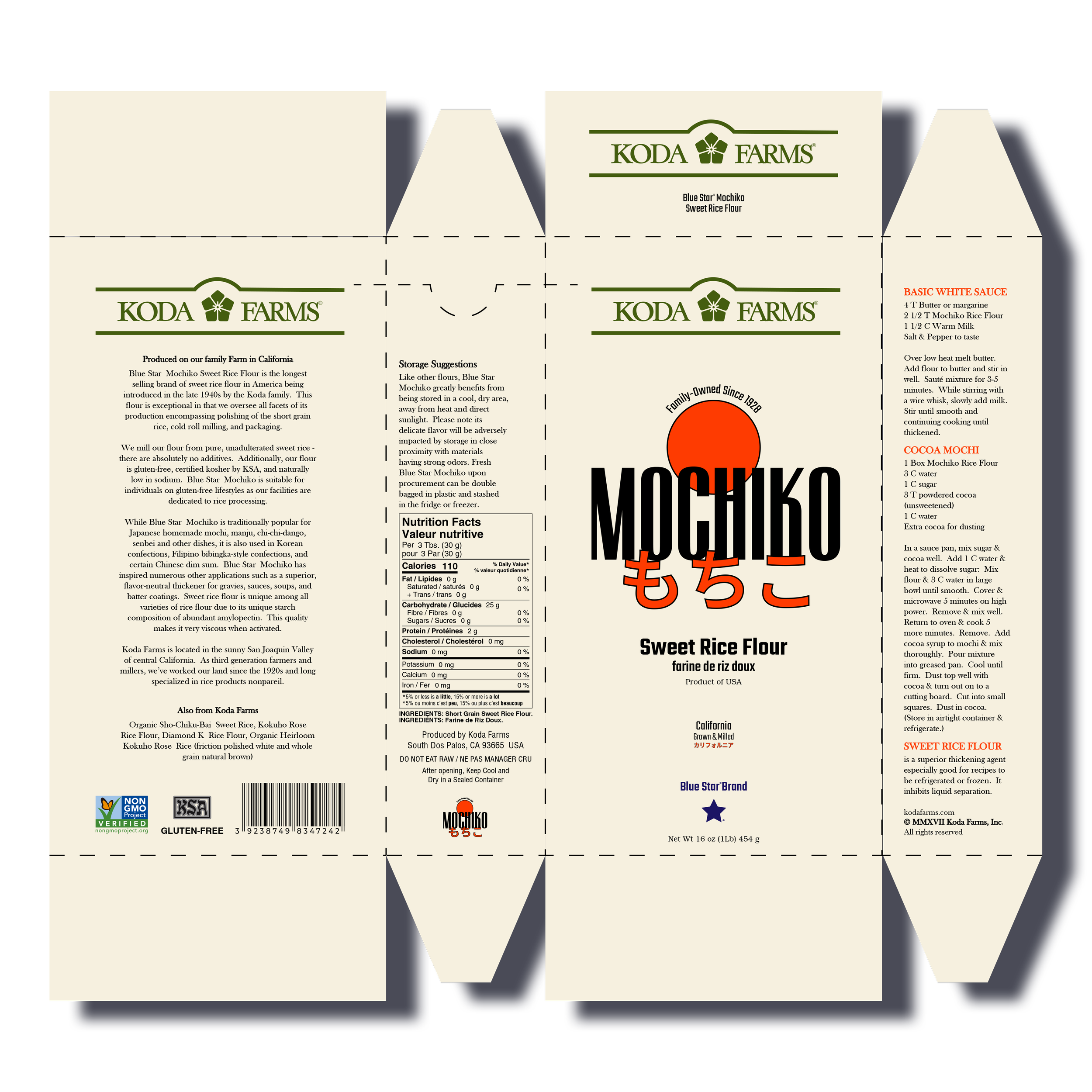
The goal is to create a captivating redesign for the packaging of Mochiko Rice Flour using only type and minimal graphical elements; as well as to push the boundaries of typographic design while effectively communicating the product and its benefits to the target audience. I used the color red to symbolise prosperity and to represent the sun on the Japanese flag. The new packaging, while very similar and staying faithful to the original design, should capture attention, evoke curiosity, and differentiate Mochiko Rice Flour from its competitors on the shelf. This approach ensures a fresh look while honoring tradition.

Packaging Design
Packaging Design
Mochiko Redesign
Mochiko Redesign