Blade Runner 2049
Poster Design
Client
School Project
Role
Designer
Year
2023
The statement of the problem of this project is to delve into one of the main themes of the movie and visually convey the solution. What I came up with was the core question of human versus replicant. Initially, I was thinking of adding “Human or Replicant?” to make the message more apparent, but opted for a more subtle approach. The poster features an enigmatic figure – an indistinguishable blend of human and replicant. This visual ambiguity mirrors the movie’s narrative and theme, where distinguishing between the two is a complex challenge. The poster invites viewers to explore the philosophical predicament posed by the film, echoing its gripping moral dilemmas.

Inventures Canada
Poster Design
Year
2023
Role
Designer/Illustrator
Client
Inventures Canada
The project’s objective was to create a visually engaging poster that represents Inventures Canada as an event that brings together innovators, startups, enterprise partners, advisors and capital. The poster should emphasize the opportunity to connect, network, discover, share new ideas, and invest in the entrepreneurial landscape. My solution to this is a visual metaphor that combines a lightbulb with a handshake to represent individuals getting together to develop groundbreaking ideas. I chose the color orange to represent confidence, energy, enthusiasm, and forward-thinking.


DEsigner Poster
Poster Design
Year
2023
Role
Designer/Illustrator
Client
School Project
This poster is a personal project of mine to pay homage to one of my favourite designers, Saul Bass. I designed a poster featuring a bold, red color palette to instantly grab the viewer’s attention but to also symbolize the pivotal moment when the narrative takes a darker turn. The central element of a hand holding a wand, casting the Expecto Patronus spell, pays homage to Saul Bass’ signature hand illustrations as well as to the main theme of the movie. This composition conveys the movie’s magical theme while enticing fans and newcomers alike to experience its captivating story.

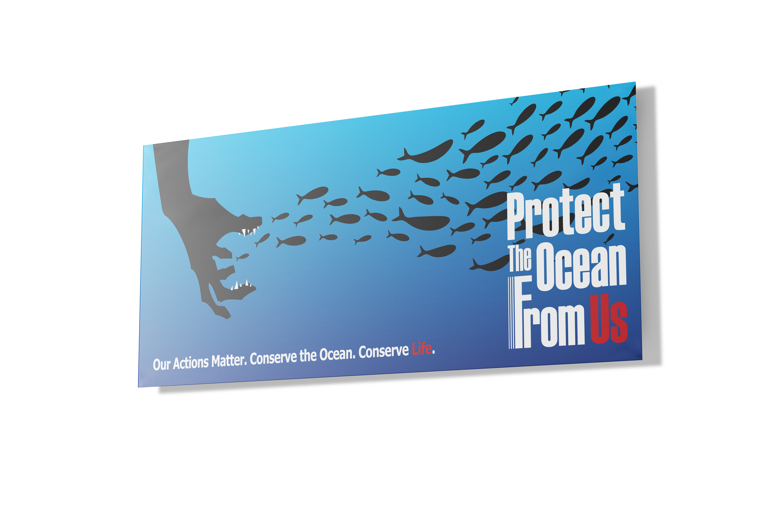
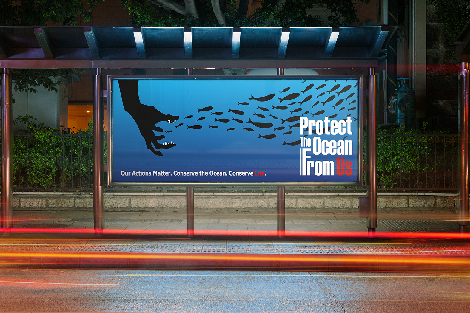
Environmental Billboard
Billboard Design
Year
2023
Role
Designer/Illustrator
Client
School Project
In my environmental protection billboard, the message is crystal clear: “Protect the Ocean from Us.” This statement is accompanied by the subtitle, “Our Actions Matter. Conserve the Ocean. Conserve Life.” The design centers around a visual metaphor—a human hand with teeth, resembling a monstrous creature, devouring the fishes in the ocean. This image serves as a poignant reminder of the destructive consequences of our actions on marine life.
The words "Life" and "Us" are in red to emphasize that the animals we are endangering are just like us—living beings. This color choice is meant to draw attention to the fact that marine life is vibrant and essential, and our actions have a direct impact on these living creatures. By highlighting these words, the billboard stresses the urgent need for us to change our behaviours and protect the ocean to conserve life in all its forms. The visual and textual elements work together to create a powerful call to action, urging viewers to reflect on their impact and take steps towards sustainable practices.